

2カラムレイアウトを使用してレスポンシブな説明用吹き出しを実現する方法
2カラムレイアウトって見やすくて便利ですよね。
左カラムに画像を置いて、右カラムに説明の文章をおくと非常に理解しやすいレイアウトになります。
この右カラムの説明を吹き出しにできると見た目もgoodでいい感じだと思います。

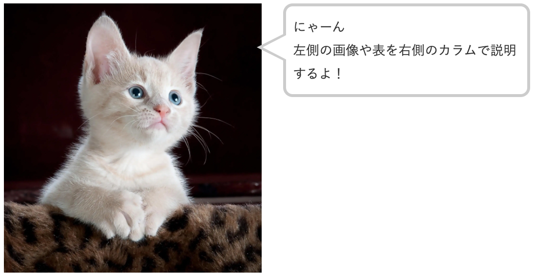
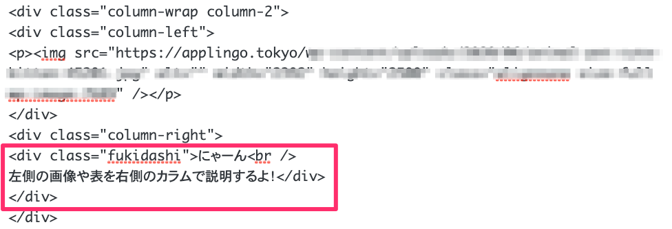
にゃーん
左側の画像や表を右側のカラムで説明するよ!
左側の画像や表を右側のカラムで説明するよ!
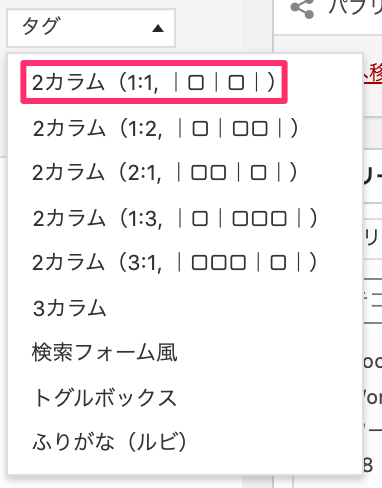
Cocoonの2カラムレイアウト
Cocoonの2カラムレイアウト使用します。
エディタ のツールボックス・タグから2カラムを選びます。
エディタ 上に2色に別れた記入領域が現れます。
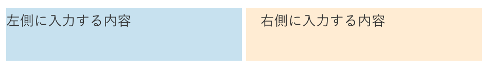
例えば左側に入力する内容というところに画像を貼り付け、
右側に入力する内容というところに説明する文章を貼り付けます。
右側の説明文章を吹き出しにしたいと思います。
吹き出しのCSS
画面の横幅が600px以下(スマホとか)になると吹き出しが下に移動するレスポンシブ対応です。
PCやタブレットなどの大きいディスプレイで表示すると吹き出しが横に表示されますが、
⇩スマホなんかの横幅の狭いディスプレイで表示するとこんな感じになります。
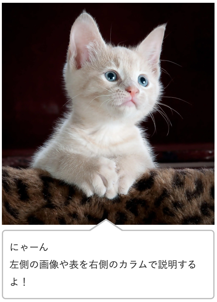
吹き出しが下に回っていい感じですね。
/*吹き出しレスポンシブ*/
.column-wrap .column-right {
border-left: none;
}
.fukidashi {
border: #ccc solid 4px;
position: relative;
background: #fff;
padding: 12px 10px;
border-radius: 13px;
margin-bottom:1em;
}
.fukidashi:before {
border-right: 40px solid #ccc;
border-bottom: 20px solid transparent;
border-top: 20px solid transparent;
top: 30%;
content: "";
position: absolute;
left: -40px;
}
.fukidashi:after {
content: "";
position: absolute;
border-right: 39px solid #fff;
border-bottom: 20px solid transparent;
border-top: 20px solid transparent;
top: 30%;
left: -32px;
}
@media screen and (max-width: 600px) {
.container .column-wrap > div {
width: 100%;
padding: 0 0;
}
.fukidashi {
border-radius: 6px;
background: #fff;
margin-top: 7px;
border: solid 2px silver;
}
.fukidashi:before {
border-bottom: 20px solid silver;
border-left: 30px solid transparent;
border-right: 30px solid transparent;
top: -40px;
content: "";
position: absolute;
left: 40%;
}
.fukidashi:after {
border-bottom: 20px solid #fff;
border-left: 30px solid transparent;
border-right: 30px solid transparent;
top: -37px;
content: "";
position: absolute;
left: 40%;
}
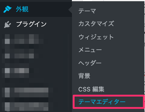
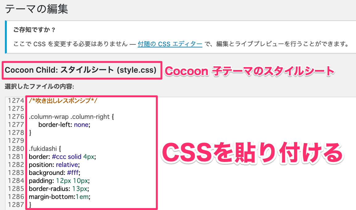
}このCSSを外観⇨テーマエディターを立ち上げて最下部に貼り付けます。
説明する文章をテキストエディタ の方で<div class="fukidashi">説明する文章</div>とすると吹き出しになります。

コメント